
How to Design a Social Link Preview Card People Want to Click
A practical founder guide to making social link previews instantly understandable, relevant, trustworthy, and worth clicking.
Every time somebody shares your website, your site gets a small pitch inside somebody else's feed.
It appears on X. LinkedIn. Facebook. Slack. Bluesky. Messages. Group chats. Community servers.
Most founders spend days polishing the homepage, then let the preview use whatever screenshot, logo, or random image the website happened to find.
DistributionOS made the same mistake.
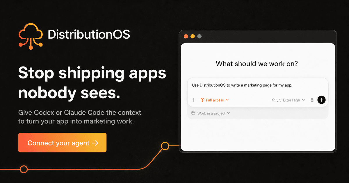
When the DistributionOS homepage was pasted into X, the preview showed an oversized product screenshot with text cut off at the edges.
It technically worked. It just gave a stranger no reason to care.
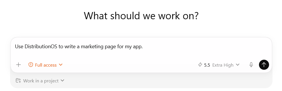
That is the missed lesson: the link-preview card is not just website setup. It is a marketing asset.
The card is the pitch before the page
Someone has to choose your link before your homepage gets a chance to explain anything.
The card often has only a few seconds to help them:
- understand what the page is about
- recognize that it is relevant to them
- feel enough interest or trust to stop scrolling
- decide that opening the link is worth it
The goal is not to summarize the entire website.
The goal is to make the right person think, "This is for me. I understand what I will get. I want to see more."
That makes the card much closer to a small ad or landing page than a decorative image.
The four jobs of a useful card
A good card does four things.
1. Get attention with one clear problem or outcome
Lead with the one thought you want someone to understand immediately.
You can name a painful problem:
Stop shipping apps nobody sees.
Or promise a useful outcome:
Know what shipped. Learn what worked.
Do not stack several messages together. One sharp promise is easier to understand than a headline, subheadline, paragraph, and feature list squeezed into the same image.
2. Help the right person recognize themselves
Attention is not enough. The card needs to feel relevant.
Use a visual that supports the promise:
- a clean crop of the real product
- a simple workflow
- a before-and-after
- the result the customer wants
- a familiar situation that reflects the problem
The visual is not there to decorate the headline. It should help a founder see how the message connects to their own situation.
3. Make the source clear and trustworthy
Include enough of the brand or product to show that the link leads somewhere real.
A small logo or wordmark is usually enough. A real product element can add proof.
The logo should answer "Who made this?" It should not become the main message.
4. Give them a reason to take the next step
The card should make the click feel useful.
That might be a simple action:
- See how it works
- Read the guide
- Try it free
- View the launch
- Get started
You do not always need a button. The headline and visual can create the desire to click on their own.
The important question is: does the card make the next step obvious and worthwhile?
How to build the message
Start with the page, not the template.
Step 1: Choose the person
Who should stop for this link?
Do not answer "everyone." Name the founder, buyer, customer, or user who should recognize themselves.
Step 2: Choose one promise
What is the single most useful reason for that person to open this page?
Write several versions. Keep the one that is clear without needing an explanation.
Step 3: Choose one supporting visual
Show the product, process, problem, or result that makes the promise believable.
If the screenshot only makes sense when somebody reads tiny labels, choose a different crop or a simpler visual.
Step 4: Add restrained branding and one action
Add the logo, product name, and next step without letting them crowd the message.
Step 5: Test it at feed size
Shrink the card.
Can someone understand it in two seconds? Does it still work without reading the post that surrounds it?
If not, remove something.
Do not turn it into a tiny landing page
The easiest mistake is trying to include too much.
Avoid:
- full paragraphs
- tiny feature lists
- several competing calls to action
- unreadable product screenshots
- text touching the edges
- oversized logos
- vague decoration that does not support the message
The card does not need to close the sale. It needs to earn the next few seconds of attention.
Keep the important headline, logo, visual, and action away from the edges. Feeds and devices may crop or shrink the image.
Give important pages their own cards
Your homepage, feature pages, blog posts, launch pages, and changelog do not all have the same job.
A homepage card can explain the broad promise.
A feature card can focus on one outcome.
A blog card can lead with the lesson.
A launch card can make the announcement clear.
You can keep the same type, colors, logo placement, and general composition while changing the promise and visual for each important page.
This gives your website a reusable set of marketing assets. Whenever you share a specific URL, the card supports the message instead of dragging every conversation back to a generic homepage.
The DistributionOS before and after
DistributionOS now uses two purpose-built cards.
The homepage card leads with the pain:
Stop shipping apps nobody sees.
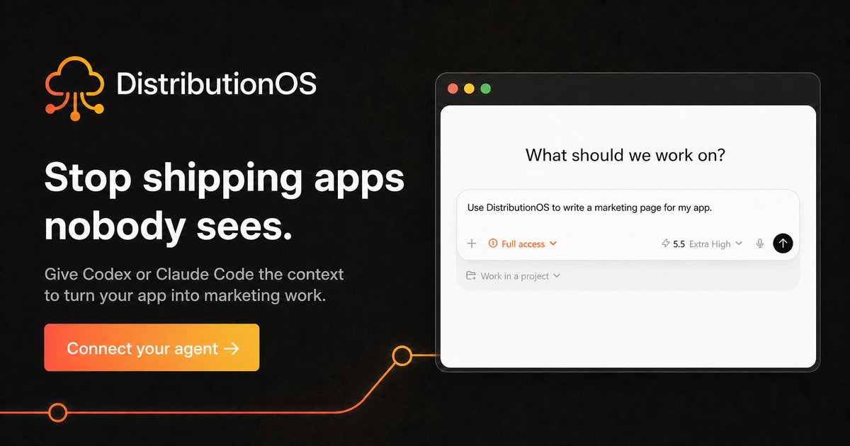
It gives a stranger a reason to care before asking them to understand the product.
The About page card leads with the outcome:
Know what shipped. Learn what worked.
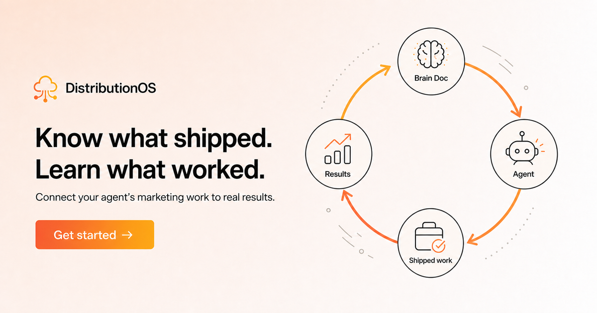
It explains the loop behind the product and fits a page where someone is trying to understand how the idea works.
Both are more useful than the old screenshot because each card has a clear audience, message, visual, brand, and next step.
The only technical handoff most founders need
A practical master size is 1200 x 630 pixels.
It is a useful working default across common sharing surfaces. It is not a promise that every platform will crop the image in exactly the same way.
The implementation handoff is short:
- use the card as the page's Open Graph image
- ask X to use a large image card
- make the image URL public
- keep the important content away from the edges
- paste the real page URL into the platforms where you plan to share it
If you use a coding agent, this is the easy part to delegate. Choosing the audience, promise, visual, and action is the part that needs your judgment.
One extra warning: social platforms cache previews. If an old image appears after an update, confirm that your live page uses the new card before redesigning it again.
A founder's card audit
Use these questions on every page you share regularly:
- Who is this card for?
- Can they understand the main promise in two seconds?
- Does the visual help them recognize the problem or outcome?
- Is the brand clear without taking over?
- Is there one obvious reason to click?
- Does the card still work when it is small?
- Is important content protected from edge cropping?
- Does this page deserve a more specific card than the homepage?
- Have I pasted the real URL into the places my audience uses?
The test is simple: if someone sees the card without your accompanying post, can they tell whether the link is for them and why it is worth opening?
Sources
- Open Graph protocol
- LinkedIn: Make your website shareable
- LinkedIn: Refresh a cached URL
- Slack: Unfurling links
- Bluesky: Website card embeds
- Apple: Create rich previews for Messages
- Next.js: Open Graph and X image metadata
- Facebook: Share a link from your Page
- MDN: Web page metadata
Evidence boundary
The 1200 x 630 recommendation is a cross-platform working default supported by current framework examples, LinkedIn's near-identical documented frame, and first-party testing. It is not represented as a permanent official requirement for every platform. Rendering and caching behavior should be rechecked before publication and periodically afterward.
Give your coding agent reusable distribution context.
Create an app record, build the Brain Doc, and let your agent ship marketing work with context instead of another blank prompt.
Connect your first app